Discover Pantone's Color of the Year, redefining luxury as quiet, simplicity, and a mindful environment. See how this delicate shade transforms chaotic interiors into spaces where you can truly unwind.
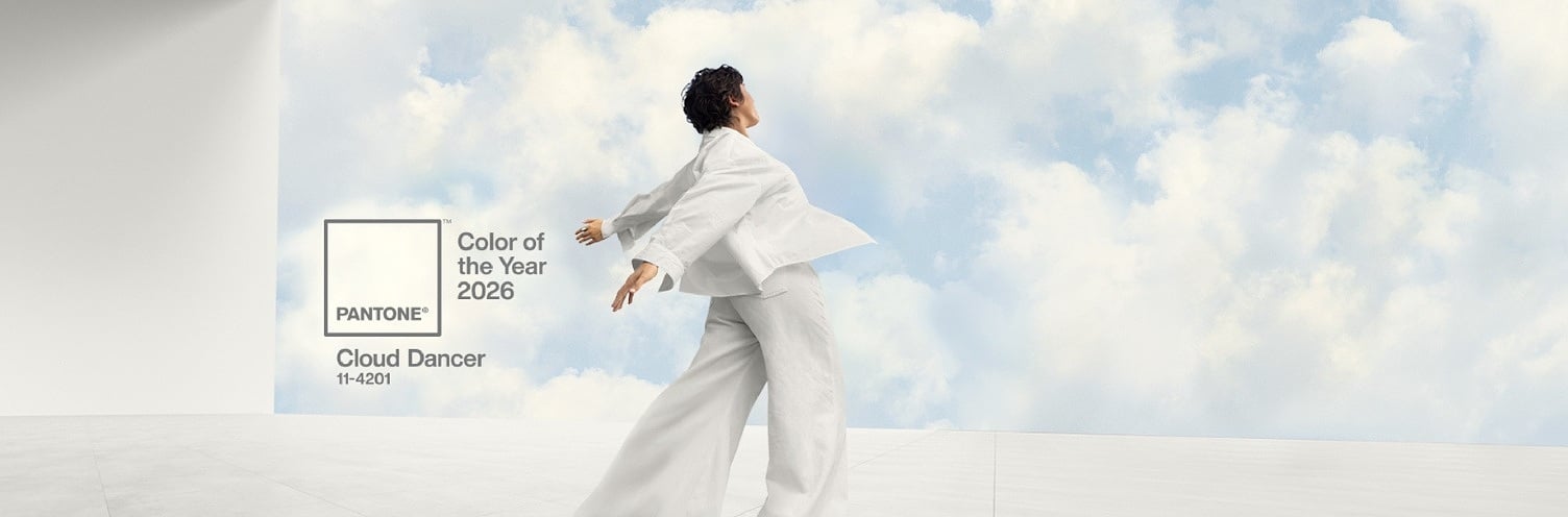
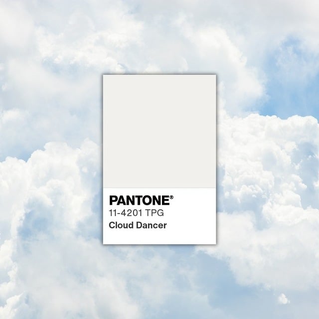
Cloud Dancer - Pantone Color of the Year 2026
In a world where we're constantly bombarded with an overload of sounds, information, and stimuli, true luxury has become silence. Pantone has aptly captured this need for tranquility, choosing PANTONE 11-4201 Cloud Dancer – a discreet, off-white shade – as the Color of the Year 2026.
As Leatrice Eiseman from the Pantone Color Institute emphasizes, this color underscores simplicity. In times when the cacophony of the outside world increasingly drowns out our inner voices, Cloud Dancer is meant to foster focus and provide relief from overstimulation.
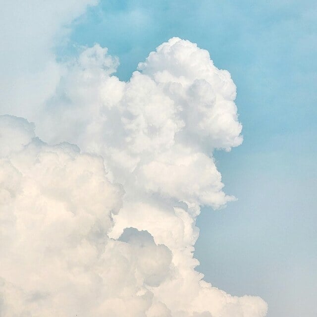
Cloud Dancer is a subtle, warm white that brings brightness, allows you to catch your breath, and – perhaps for the first time in a long while – focus on what truly matters.


Cloud Dancer in Interiors
The Pantone Institute is a place where they observe daily how colors influence our lives – from fashion and design to architecture and visual culture. The annual selection of the Color of the Year is not just an aesthetic guideline – it's the result of months of analyzing culture, technology, art, social moods, and how our way of life is changing. That's why this choice has a real impact on designers and brands – it doesn't dictate trends, but accurately describes the moment we're in and inspires the direction we're heading.
Cloud Dancer is the first white shade to earn the title of Color of the Year – a symbolic shift towards simplicity and clarity. And that's precisely why it probably speaks more about our needs than any intense color.
Importantly, this year's vanilla-cream shade is a natural progression from the 2025 Color of the Year, Mocha Mousse – a warm, earthy brown that encouraged grounding, slowing down, and seeking comfort in nature. Now, we transition from an enveloping, coffee-like depth to lightness and space. Cloud Dancer becomes a visual reset – a neutral, clean base that allows for a fresh perspective on both interiors and our own daily lives.


What colors to combine with Cloud Dancer - Pantone Color of the Year 2026
This is a shade that sets the rhythm of an interior without dominating it. It pairs beautifully with natural palettes and soft accents. Discover what best complements Cloud Dancer:
1. Natural Tones – Grounding Warmth
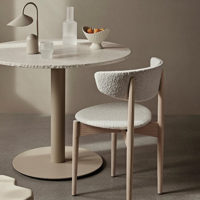
Beiges, olive green, terracotta, and warm shades of brown are colors that naturally gravitate towards Cloud Dancer. Together, they create an interior that is the epitome of home – a place you return to for a sense of grounding. These colors introduce a touch of earthiness and authenticity: terracotta adds warmth, olive subtly calms, and browns visually stabilize the entire composition.
This is an ideal duo for those who appreciate minimalism but don't want to sacrifice coziness.
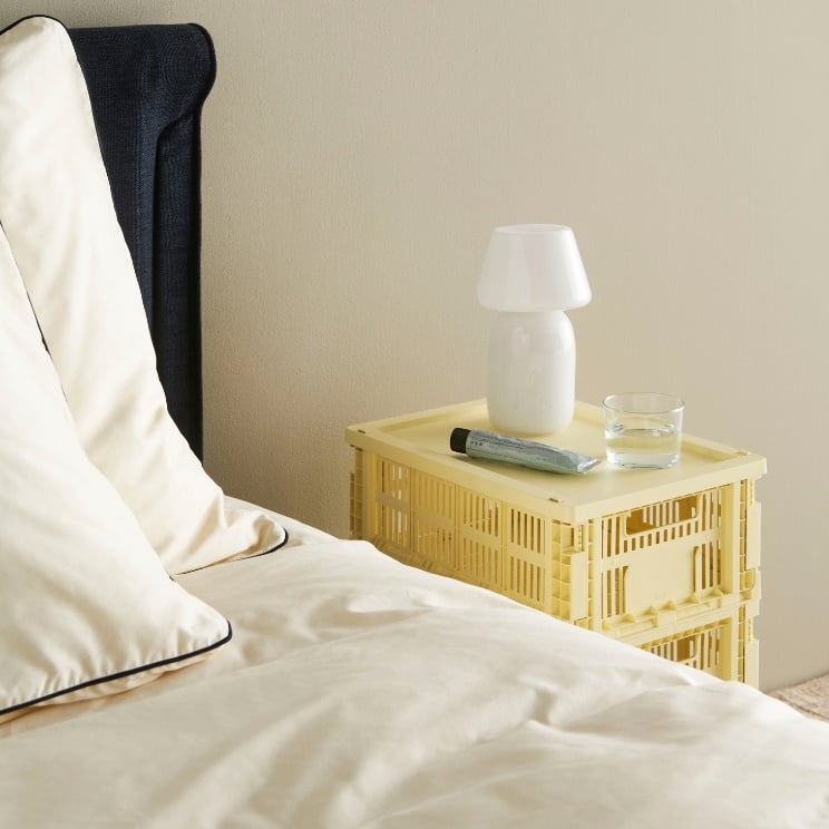
2. Powdery Pastels – Freshness and Soft Energy
Peach Dust, Lemon Icing, and other powdery pastels from the Pantone palette introduce a delicate, light energy into the interior. Their presence is subtle but palpable – they lend a sense of airiness to the space without introducing chaos.
These are excellent colors for bedrooms, studies, or relaxation zones, where we aim for visual calm with a hint of optimism. When combined with Cloud Dancer, they look like soft brushstrokes of light on a bright background.
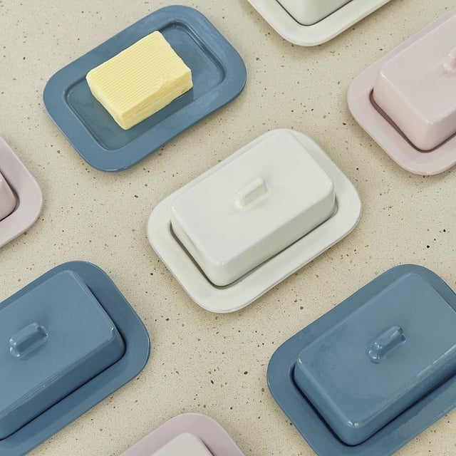
3. Soft Contrast – A Modern Accent
Muted blue and small touches of black are a way to introduce a more distinct accent into the interior, while still maintaining a sense of calm.
Muted blue gently corresponds with the character of Cloud Dancer – it resembles the sky just before sunrise, cool but soothing.
Black, on the other hand, acts like jewelry in an interior – a small detail in a mirror frame, a lamp base, or a furniture handle is enough to add contemporary expressiveness to the composition. In this rendition, the contrast is not aggressive, but elegantly emphasizes the purity of white.


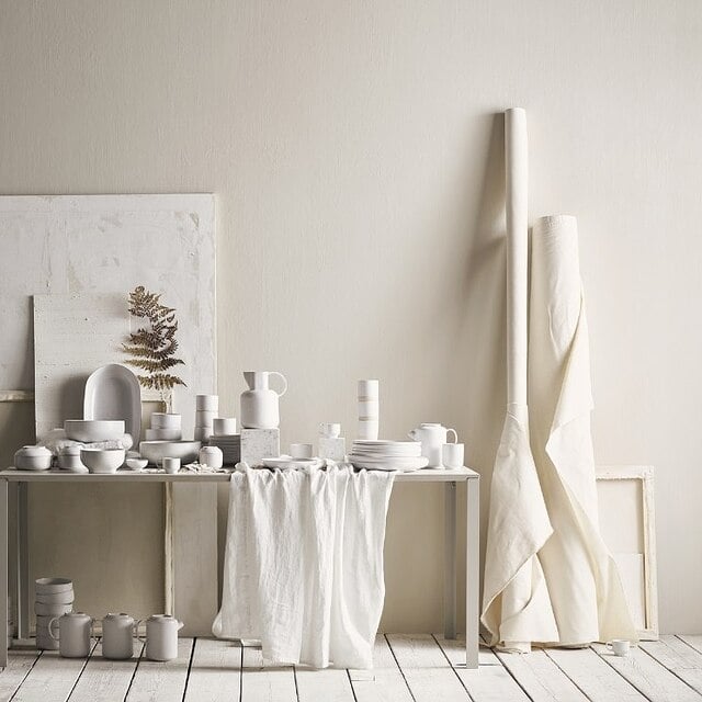


Cloud Dancer - fabrics, textures, materials
In interiors inspired by Cloud Dancer, touch is paramount – it builds the atmosphere and makes white cease to be a cold backdrop, becoming an experience instead. Materials should soothe, envelop, and interact beautifully with light, creating a space where you simply feel good.
- Linen in this context is more than just a fabric – it's a way to introduce a touch of natural ease into the interior. Its matte surface gently filters light, casts soft shadows, and introduces a calm rhythm. On curtains, bedding, or tablecloths, it creates an effect of understated elegance.
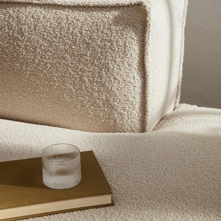
- Plush, looped bouclé is already a symbol of contemporary comfort. In an off-white shade, it gives the impression of a soft, safe cocoon – perfect for an armchair, sofa, or cushions. Its three-dimensional texture breaks the uniformity of white and adds coziness to the interior without visual weight.
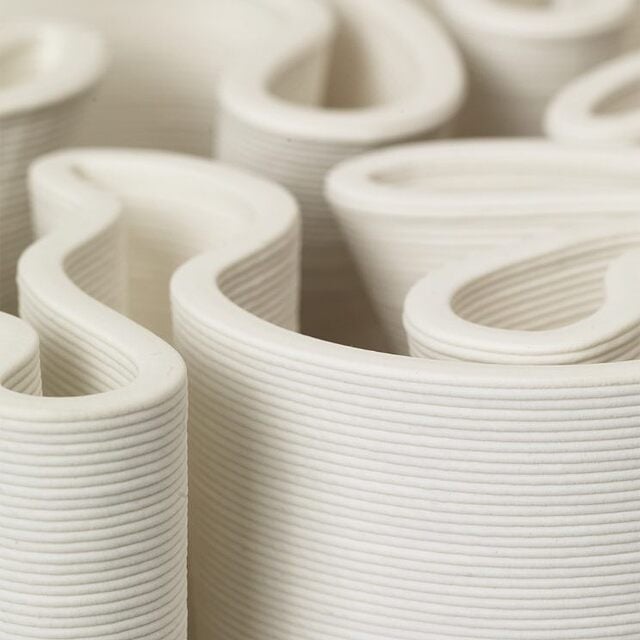
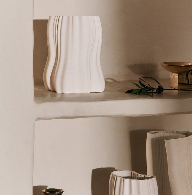
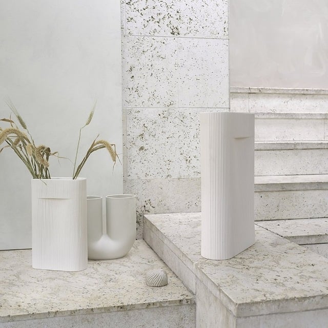
- Matte, raw ceramics in Cloud Dancer shades introduce a distinct accent of naturalness. Vases, bowls, or decorations with a rough, irregular texture add an artisanal character to the interior and balance the softness of textiles. It's a detail that subtly catches the eye without disrupting harmony.
- Furniture with soft, rounded lines softens the space – literally and perceptually. The absence of sharp edges makes the interior calmer, more fluid, and sensory-friendly. A rounded coffee table, a slightly curved dresser, or an organic lamp shape enhance the sense of harmony that is central to the entire Cloud Dancer aesthetic.
Learn more about creating a cozy interior in our magazine Cozy and Wellness in Interiors.


Accessories and Furniture in the Spirit of Cloud Dancer
The selection of accessories here is like composing a serene stage – quality, not quantity, is what counts. We've chosen a few products that should form the basis of a soothing arrangement with Cloud Dancer in the starring role.
Bouclé Armchair
Soft, rounded, in creamy white. Perfect for creating your own soft sanctuary.
Simple Ceramic Forms
Matte vases and dishes in off-white add structure to the interior without introducing chaos.
Lamps that Set the Mood
Linen lampshades, rice paper, gently diffused glow. Calmer light equals a calmer space.
Coffee Table with Rounded Lines
Bleached oak or ash, natural finish, and a soft form. A discreet element that beautifully completes the whole.


Cloud Dancer – A New Dimension of Simplicity
Cloud Dancer is not a color meant to dazzle. Instead, it helps create interiors where it's easier to breathe, easier to relax, easier to just be yourself.
Treat this year's Pantone Color of the Year as an invitation to view your home not as a storage facility for objects, but as a space that fosters clarity. A quiet backdrop for living at your own pace.