In 2026, we celebrate the 100th anniversary of Verner Panton's birth. It was he who brought neon colors, futuristic shapes, and a joyful imagination to simple interiors. His iconic designs continue to inspire designers worldwide, and the artist's centenary is the perfect opportunity to recall his revolutionary legacy.
100th Anniversary of Verner Panton's Birth
The year 2026 is an absolute milestone in the design world. Exactly 100 years ago, on February 13, 1926, in Gamtofte on the Danish island of Funen, Verner Panton was born – a man who decided to break away from Scandinavia's safe, beige-and-wood aesthetic and introduce a wave of saturated colors and futuristic shapes into interiors.
In the 1960s, the design world spoke with one voice – a toned-down, wooden, organic one. And then along came a Dane with a suitcase full of orange plastic and a vision of interiors resembling the inside of a spaceship. “The main purpose of my work is to provoke people into using their imagination,” Panton used to say, and he took that very seriously.
Panton was no typical Scandinavian architect. He was a rebel, a visionary, and above all – a man who believed that space can and should be joyful. To mark his centenary, the world's greatest museums and leading interior brands, such as Louis Poulsen, Montana, and Vitra, have prepared spectacular launches and exhibitions.
Discover this extraordinary legacy and get to know the icons that – despite the passing decades – continue to define modern interiors.


Verner Panton: The Rebel in a Volkswagen
The beginnings of Panton's career were inextricably linked with design giants, but also with a rebellion against them. Between 1950 and 1952, he apprenticed under none other than Arne Jacobsen, the legendary creator of the Egg chair, working on projects like the famous "Ant" chair. For the young Panton, this was an invaluable school of craftsmanship and proportion, but also a source of deep frustration.
Jacobsen, though a master of form, was too... safe for Panton. Too attached to natural materials, too loyal to Danish tradition. Panton felt suffocated by the omnipresent wood in Denmark and that clean, almost ascetic aesthetic. He dreamed of something more – of spaces that don't soothe, but excite. Of colors that don't just accompany, but lead the way.
And then he made a decision that perfectly captured his character. Instead of renting an office in Copenhagen and waiting for commissions, Panton converted a Volkswagen van into a mobile design studio and hit the road across Europe. For several years, he lived on wheels, stopping in Paris, Milan, Zurich – wherever the design avant-garde was living life to the fullest. He absorbed international trends, made connections, and sketched in cafes and hotel rooms.
This openness to the world – both physical and mental – made him a designer without borders. His designs were no longer just furniture. They were "tools for building a mood", as he called them. They were a manifesto of the belief that design can – and should – change the way we live.
Verner Panton's Color Philosophy: When Color Becomes Function
For Panton, color was never just decoration – it was a function, a tool, a language. His famous motto was: "One sits more comfortably on a color that one likes". He believed deeply that colors have the power to change the mood, the temperature of an interior, and human emotions, and that choosing them should be a "conscious decision", not a coincidence or a compromise.
In the 1960s and 70s, when most architects thought of interiors as a collection of individual objects, Panton designed entire landscapes – the so-called Gesamtkunstwerk – where floors, walls, and ceilings merged into one psychedelic whole. His installations were total: you couldn't just pick a Panton chair and put it in a beige living room. You had to embrace the whole philosophy, the whole vision. The best examples of this were the legendary installations on the passenger ships of the Visiona lines (1968-1970). Panton created spaces there that looked like the inside of a dream – either a very good one, or... a very strange one, depending on your mindset. Fantasy Landscape, one of his most famous arrangements, was a red cave full of organic shapes where the boundary between wall and seat disappeared, and the viewer became part of the installation itself.
Equally revolutionary was the interior of the Spiegel publishing house in Hamburg (1969), where Panton applied an intense palette of orange, red, and purple to an office space. At a time when offices were gray and boring, this was an act of true courage. Or maybe madness? For Panton, those two words often meant the same thing.
Fascinatingly, behind this explosion of color lay a precise theory. Panton spent years studying color psychology, analyzing its impact on our well-being. Every combination was deliberate: orange added energy, blue cooled the space down, red created intimacy.
His famous color map was not just a designer's palette – it was an emotional map. Panton believed that you can design not just shapes, but well-being itself.
Read more about design that acts like a dopamine hit: Dopamine Decor: This Interior Brings Joy.

Verner Panton's Most Famous Designs
Panton created hundreds of designs – from lamps to entire interiors – but a few of them changed the face of modern design forever. These are not just furniture or objects. They are manifestos of a vision where form meets emotion, and function meets imagination.
Meet two icons that best capture the spirit of the Danish designer's work: a lamp that turned light into sculpture, and a furniture system that proved industrialism can be elegant.
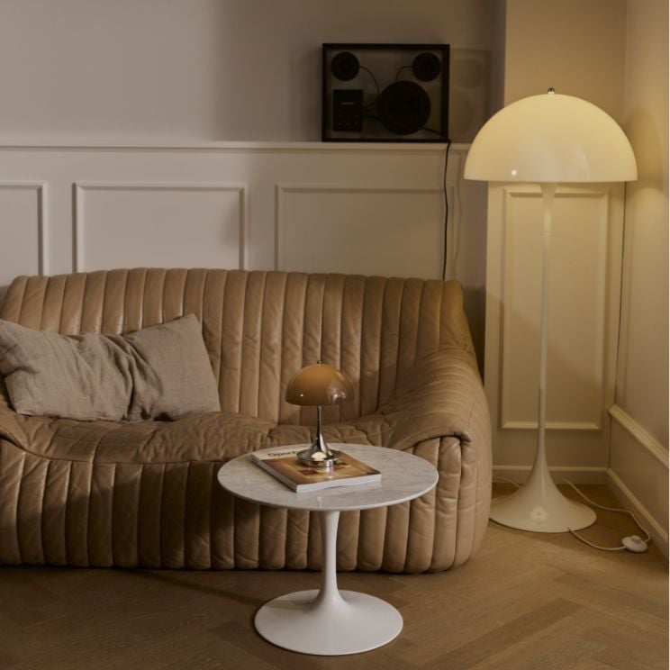
Louis Poulsen x Panthella: A Sculptural Light
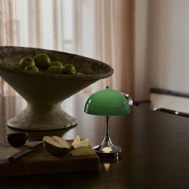
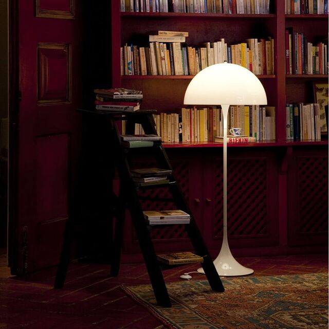
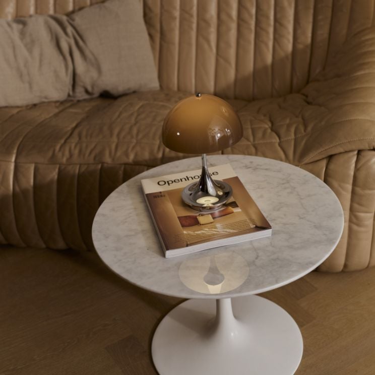
Among Panton's many projects, his collaboration with the Louis Poulsen brand resulted in the creation of one of the most recognizable lamps in the world in 1971 – Panthella. And its story begins with a friendship.
Poul Henningsen, the legendary Danish lighting designer (creator of the PH lamp series), was Panton's mentor and friend. It was Henningsen who taught the young rebel that light is not just about function – it is about mood, intimacy, and emotion. That a good lamp doesn't glare, but embraces you. Panthella was a tribute to those lessons.
Panton dreamed of a lamp where both the base and the shade would serve as a reflector – emitting a soft, glare-free light diffused evenly in all directions. The mushroom-like shape was no accident: it was precise geometry that turned an ordinary lamp into a light sculpture. Panthella doesn't just light up a room – it creates an atmosphere.
The colors, however, were the most radical part. While Louis Poulsen produced mainly white lamps, Panton demanded opal shades: orange, red, brown, green. For him, Panthella was not just meant to be functional – it was meant to be a manifesto, a shout of joy.
And so it became. Panthella appeared in countless movies, magazines, and homes of designers worldwide. Today, over 50 years later, it still looks like it's from the future.
To mark Panton's centenary, Louis Poulsen has launched those original opal colors from the 1970s – Opal Orange, Opal Red, Opal Brown, and Opal Green. This is The Originals limited edition, returning to the roots, to the master's initial vision.
And for lovers of minimalism, there is also the contemporary Panthella V3 version (in sizes 160 and 250), which combines the classic shape with modern LED systems and wireless charging.


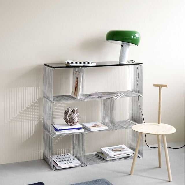
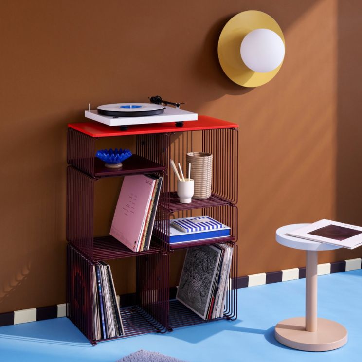
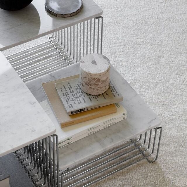
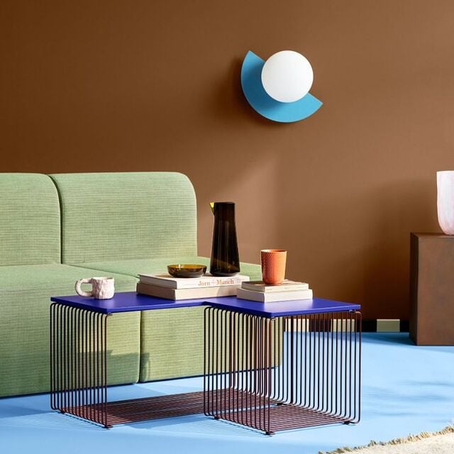
Montana Panton Wire: The Industrial Lightness of Being
Although Panton is primarily associated with organic shapes and brightly colored plastic, his genius also shone through in a completely different language – raw, industrial, and geometric.
The Panton Wire system, designed in 1971 for Montana, was born out of a long-standing friendship with Peter J. Lassen, the brand's founder. Lassen and Panton shared a similar approach to design: both believed in modularity, functionality, and versatility. Plus, they both hated rigid categories.
Panton Wire is a collection of furniture made of bent wire – chromed or lacquered – that can be combined in almost endless configurations. It is the definition of a functional paradox: raw yet elegant; industrial yet visually lightweight. It can be a side table, a hanging shelf, a room divider in a loft – whatever you want it to be.
Interestingly, this system was created at the same time as Panton's most psychedelic installations. For him, there was no contradiction between organic plastic and geometric wire. He was convinced that good design is flexible design – tailored not to a single style, but to individual needs.
To mark the anniversary, Montana is expanding the Panton Wire range with new, compact modules and colors inspired by the master's palette: Snow, Black, Monarch, Pine, Black Red, and Rosehip. It is a tribute to the vision of a man who knew how to blend eclectic inspirations.


What Will 2026 Bring for Verner Panton Fans? Major Launches and Limited Editions
The centenary of his birth is a moment when the design world pauses to pay tribute to one of the greatest visionaries of the 20th century. Discover what Panton's key partners have prepared for this special year:
Vitra: A Two-Tone Heart
Swiss brand Vitra has announced a limited edition of the famous Panton Chair – the world's first chair made from a single piece of plastic (1967). Interestingly, the final colors for the 2026 edition – Bold Orange, Flash Red, Electric Blue, and Bright Turquoise – were chosen by public vote. This democratic approach to design would have resonated with Panton: he always believed that design should belong to the people, not to museums.
But the real sensation is the launch of the anniversary edition of the Heart Cone Chair in a duo-tone version, debuting exactly on his birthday – February 13, 2026. The chair is upholstered in Kvadrat Divina fabric in two shades of blue, highlighting its sculptural, geometric form. The Heart Cone is one of Panton's most spectacular designs – a chair that looks like a steel flower or... a futuristic throne, depending on how you look at it.
&Tradition: Flowerpower in New Colors
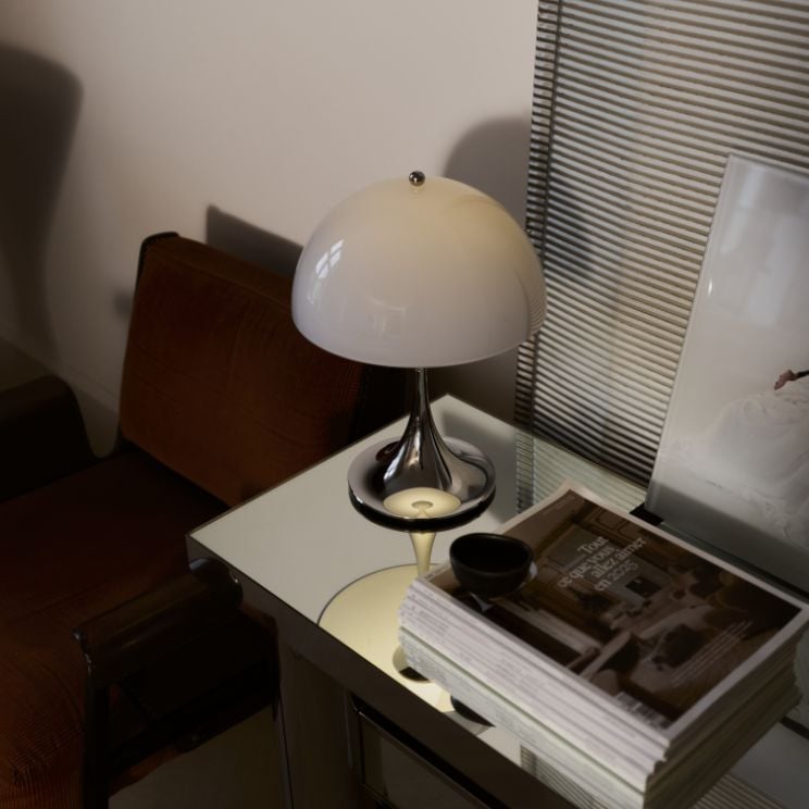
The &Tradition brand is celebrating by introducing new colors to the iconic Flowerpot lamp series: Ivory, Zesty Orange, and Steel Blue – based on Panton's psychological color map. The Flowerpot, designed in 1968, is the epitome of pop-art aesthetics: two hemispheres forming a flower that glows. Simple, joyful, iconic.
The range also welcomes the reissued Wire Stool and the Topan lamp in floor and table versions. Topan, with its characteristic horizontal stripes of perforated metal, is another example of Panton's love for light as sculpture.
Verpan: A Journey Through Time
Verpan, a brand dedicated exclusively to Panton's legacy, will mark the anniversary with a unique visual campaign shot by photographer Casper Sejerssen. The campaign documents six decades of the master's work – from early wooden experiments to futuristic plastic landscapes.
A Pilgrimage in the Master's Footsteps: Where to Celebrate in 2026?
For true design fans, 2026 is an opportunity to visit exhibitions that happen once in a hundred years. Here are the places that should be on your map:
Vitra Design Museum (Weil am Rhein, Germany)
From May 2026, the exhibition Verner Panton: Form, Colour, Space will present a full reconstruction of the legendary Fantasy Landscape installation from 1970. It is a psychedelic cave where the floor becomes the ceiling, and viewers become part of the artwork. If you dream of feeling like you're in the 1970s, at the peak of a utopian design vision – this is your chance.
Kunstgewerbemuseum (Berlin, Germany)
The World of Colours exhibition (November 2026 – May 2027) will let you immerse yourself in a utopian world of plastic and color. The German museum promises not just a display of designs, but a full sensory immersion – complete with music, light, and scents of the 60s and 70s.
Port Bogense (Funen, Denmark)
In Panton's home region, on the island of Funen (Nordfyn), an outdoor sensory exhibition telling the story of his life will take place. It is a tribute to the man who always said he "left Denmark so he could return to it". Funen is where it all began – and the place Panton returned to in his thoughts throughout his life.
Circus Building (Copenhagen, Denmark)
It is well worth visiting the Circus Building, whose interiors were recently restored in line with Panton's original, bold color scheme from 1984. It is a living building – people live and work there – yet it still looks like an art installation.
And if you want to live like Panton, stay at Copenhagen's Hotel Alexandra in The Colour Vision Suite dedicated to the designer. It is a room where every detail – from the lamps to the textiles – bears the master's signature.
You can find out about other exhibitions on the official designer's website, run by Verner Panton Design AG.


Verner Panton: A Legacy That Doesn't Fade
A hundred years since Verner Panton's birth, the design world is rediscovering him. And best of all, his vision hasn't aged a day. On the contrary – at a time when most interiors look identical (gray, concrete, minimalism), Panton returns as a manifesto of joy and courage.
His designs are more than just furniture. They are an invitation to live in color, to break the rules, to use your imagination. They are a reminder that the space we live in doesn't have to be just safe – it can be inspiring, provocative, and alive.
Panton didn't want to design for museums. He wanted to design for people who have the courage to be themselves. For those who believe that life is too short for beige walls.
And that is why his icons – the Panthella and Flowerpot lamps, the Montana Wire shelving, the Panton Chair – are still very much alive. Not as relics of the past, but as tools for building a better, more colorful future.
A hundred years have passed. But Panton's colorful rebellion lives on.


“Panthella is unique for many reasons, but especially so in how both shade and trumpet
shaped base serve as reflectors, a true testament to Verner Panton’s innovative mind”
– Monique Faber, Chief Design Officer, Louis Poulsen