
Every year brings new fashions – some stick around, others quickly fade. This is true for clothes, and it's equally true for interior design. That’s why we’ve chosen some universal trends that might inspire you to shake things up in your surroundings. And why not? After all, it’s always worth keeping your ear to the ground and knowing what’s buzzing in the world of design!
Current colour trends in design
This year’s arrangements are full of both strong colours – such as cobalt or Viva Magenta – and contrasting pastels, creams, and nature-inspired shades. Many colours can be boldly combined, creating unique colour schemes that make interiors incredibly stylish. When choosing wall colours and accessories for individual rooms, it’s worth considering a few additional factors besides current trends. We're talking about interior lighting, furniture layout, and the size of the room itself. In the case of small rooms, it’s best not to paint all walls an intense, dark shade – it might make the interior appear even smaller. However, if you have large, spacious rooms, bold colour choices will be a definite plus. When looking for the perfect colour, beyond fashion, it’s also worth being guided by your own preferences – after all, you should feel completely comfortable in your own home. What’s “trendy” isn't always right for everyone. But if you want the most fashionable colours of the year to reign in your home, this year you have a real blank canvas!


Viva Magenta
It will surely come as no surprise that one of the biggest colour trends in design is the use of Viva Magenta. After all, it’s this year’s colour according to the Pantone Institute! Walls and accessories in this beautiful, vibrant shade of pink are currently dominating interiors, regardless of their style. It’s a bold colour – so a good idea would be to combine it with lighter, muted colours. It pairs wonderfully with beige, off-white, light grey, or dusty pink, among others. Just one wall painted in this striking, energising shade will instantly liven up a room and give it a unique character. However, if you prefer more subtle walls and bolder accessories, a few smaller accents in Viva Magenta will also immediately catch the eye.


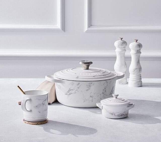
Off-white
White was fashionable in interiors some time ago – but now, off-white, in a creamy shade, is trending. When combined with cosy shades of beige, it looks truly aesthetically pleasing and makes the arrangement very stylish. It’s important not to confuse cream with buttery shades or the ecru that was popular years ago. Off-white pairs well with contrasting accessories – e.g., in pastel shades – as well as when the entire interior is decorated in shades of white. Creamy walls and furniture also look fantastic when combined with wooden and wicker accessories in a boho style.


Soft lemon, peach, and blue, i.e., pastels
Delicate, pastel colours will continue to be fashionable in interiors – for example, a pleasant-to-the-eye blue, peach, pink, pale green, or a light lemon shade. They are perfect for relaxation and work well in both modern and retro-style arrangements. Pastels are often combined with each other or contrasted with a darker, more intense colour. Importantly, they don't have to mean dull arrangements. Pastel colours don’t affect residents as intensely as strong shades of yellow or green, but they still bring a breath of joy, sunshine, and refreshment into interiors. Many brands, such as KitchenAid, have opted for a wide range of colours, from pastels to strong, vibrant shades, so that each product can be easily matched to the decor.


This season, interior arrangements are dominated by intense colours and bold combinations – though pastels will also find their place in interiors. So, what colours should you incorporate into your home decor to not only look beautiful but also follow current trends?
Intense cobalt and plum
The absolute opposite of muted pastels is strong, striking cobalt, which is also abundant in interior design. However, it works best when combined with lighter, muted colours – otherwise, it might overwhelm the interior with its intensity. An ideal solution is one wall painted in cobalt paired with more delicate colours. In addition to cobalt, accessories and walls in shades of purple, such as veri or plum, also appear in arrangements.


Gentle sage
Another popular colour this year is sage green. It's an incredibly delicate, soothing shade with a natural feel that brings peace to an interior and encourages relaxation. It looks very good when combined with greys, black, and wood. Sage is generally a safe colour that not only suits many arrangements but also stays in fashion for a long time. So, if you want to opt for a muted, yet stylish and fashionable colour in your interiors, it will prove to be a very good choice – for both the living room and the bedroom.


Buttery shade
If you're wondering what delicate, light colour to choose for your interiors, you can boldly opt for a buttery shade. Its popularity was already noticeable at this year’s Copenhagen Fashion Week. It's a pleasant-to-the-eye colour, bringing to mind spring, sunshine, and blossoming nature. It harmonises perfectly with pastels and classic white, among others.


Trendy graphites
Another fashionable colour dominating arrangements is graphite. It's an exceptionally versatile shade, which perfectly combines with single gold accents – for example, taps, furniture handles, or plant pot covers. However, it's worth breaking it up with a lighter or vibrant, intense shade so that the interior doesn't become too dark and overwhelming. Dark grey pairs wonderfully with strong yellows and greens, though you can also boldly combine it with white or light beige. It also looks perfect when paired with black and wood – a good choice for industrial-style interiors.


Warm natural browns
When it comes to colour trends, this year it’s also worth opting for browns in interiors – more precisely, their warm, lighter shades. Off-white brown combines perfectly with buttery or ecru colours, for example. It introduces an exceptionally warm, cosy atmosphere into interiors and works ideally in homes where natural accents lead the way. Browns are also an ideal base for arrangements with wicker, leather, or stone.


“Blushing” beige
Another colour that immediately catches the eye in arrangements is warm beige subtly “tinged” with violet. It's an elegant, muted, and original shade that will pass the test in many interiors. This colour is a warm undertone of pink, giving the decor a unique charm. It looks best when combined with cream and beiges – such interiors reflect exceptional cosiness and warmth.


As you can see, this year's colour trends aren't limited to just one type of colour. So, if you're planning a small renovation at home and want to transform the look of your interiors by painting the walls new shades, you don't have to hold back! Whether you paint the whole room in cream or combine intense cobalt with pastels is entirely up to you. Choose a colour that will always make you feel “at home” and add a unique character to your domestic interiors.


